 Shiner is being published in Scrapbook Creations in a few months' time.


And here are a couple of layouts produced from a sketch request from Scrapbooking Memories magazine:
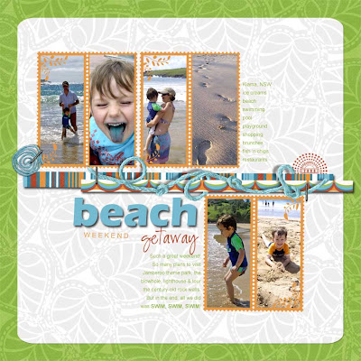
Beach Weekend Getaway
(By Katharyn Brine)
Materials List:
Software: Adobe Photoshop Elements 6. Digital Paper: Michelle Martin “Kiana” patterned papers. Other: Lindsay Jane Design postage frame (recoloured), Katie Pertiet yarn swirl (recoloured) & staple, Mindy Terasawa “dot dot date” stamp. Fonts: Eras Bold ITC (title), Arial and CK Ali Offical.
Details of Approach to Layout:
My inspiration for this layout came from a bunch of bright new digital papers I wanted to use, rather than a set of photos or a story I was compelled to tell. I don’t normally approach a page like this, but every once in a while it feels good to simply “play” at crafting – the fact that I’m still recording memories and moments is a bonus!
Straight away I knew I wanted to use cuts of ribbon or patterned paper across the middle of the sketch. When I came across my yarn in my digital stash, I decided it would tweak the page up a little – especially if I could “weave” it around the other bits of patterned paper.
My background papers needed to be light enough to easily read my intended journalling, because I planned to write straight onto the paper rather than use a tag or label. I also wanted to put into action a new technique I had discovered to round the corners of digital paper. (Much harder than it sounds, compared to simply pulling out a punch with traditional scrapping L!) I love using white backgrounds, especially with multiple photos. The green was a bit out of my comfort zone but that’s what it’s all about – giving myself permission to play!
Next, I searched through my photos looking for a series of happy shots – these beach ones were perfect. And I loved that some of them included colours I had featured on my page already – turquoise & red. The colours, theme and sketch were all coming together nicely. Don’t you love it when that happens!
I searched for frames that I hadn’t used yet, and came across these postage ones that included a little leaf motif in the corners – just like my background paper! I copied several of these and set them out on the page according to the sketch. I’m an asymmetrical girl, so I shuffled a few more up the top as well.
I like to use the “rule-of-thirds” whenever I can, so I try to avoid placing any prominent photos or journalling smack bang in the middle of a page. When it came time to apply my elements, I stuck to this rule too, making sure to arrange them in a triangle formation across the layout.
I had to “flip” a couple of the photos so the subject was facing “into” the page – just make sure there is no text in the photos if you do this, because it will turn out mirrored! I lightened up a few of the shots here as well, so all six looked relatively even when viewed together.
The title came next. I racked my brain for a catchy single-word title but my wit escaped me this time! So I did the next best thing – highlighted one word in my title, and mixed up the fonts and sizing of the rest, so the whole thing became a feature itself. I think they call this typography. Cool.
I typed whatever memories came into my head for the journalling. Again, I made the columns asymmetrical, moving them until they fitted into their spaces quite nicely. I notice now that the top one resembles the long, skinny photographs, and the lower one is short and stumpy like the photo block.
Lastly, I worked on all of my drop-shadows to give the page and elements some dimension. I used the eraser tool to “weave” the yarn around the coloured paper pieces. I “attached” them with staples. I gave the title a shadow to resemble American Crafts foam thickers. Then I saved it as a high-resolution jpeg file, and then as a low-resolution one to upload later on, and called it done.
Three Tips / Techniques
1. Make sure photo subjects are not looking “out” of the page. It disrupts the viewer’s flow and creates an imbalanced page.
2. Experiment with colours you wouldn’t normally use. Dare to be adventurous!
3. Don’t lock yourself into scrapping to a “formula” - where you feel photos are the only way to start a page. Try using patterned paper, colour themes, typography design, or a sketch as your initial inspiration.

Weekdays Without You
Katharyn Brine, NSW
Materials:
Software: Adobe Photoshop Elements 6. Digital Paper: Katie Pertiet “Bit of Grunge No.3”, Lynn Grieveson “Worn Strips”. Letters: Katie Pertiet Red “Chipboard Chunky Alphas” Other: Katie Pertiet Little Round Tabs, staple & Photo Cluster No 11. Fonts: Myriad Pro & PeaCammi-pea.
Approach:
This was a story begging to be told. My eldest son had just started big school and I was apprehensive about how his little brother would cope without his best friend around. The urge to record it became even more compelling when he reacted differently to this change than what I had expected.
Straight away I knew I wanted to use cuts of ribbon or patterned paper across the middle of the sketch. After digging through my digital stash I found these strips of patterned paper with stitching and torn ends – perfect for the texture I wanted to create with this layout. I had to stretch and resize them a bit to fit across the page, and I staggered their ends. I stuck with bright primary colours because I planned to use black and white photos anyway.
I didn’t have any specific photos I wanted to use, so the next best thing was to find photos picturing the two of them together at various stages of their lives, with a main focal photo of Riley. They have played together, living in each other’s pockets, for the past five years so finding group shots of them was no problem.
I’m into circles at the moment, so I adapted the sketch a bit to include a cluster of circle frames. I recoloured the photos to black and white, increased the contrast a bit and individually “clipped” (control-G) them into each frame.
This is a non-destructive way of cropping the photos, and it allows me to move the photo around within the frame until I’ve got it the way that I want. I also try to set the subjects slightly off to one side within the frame and I always make sure no one is looking out “off” the page. This helps create balance.
My background paper needed to be light enough to easily read a big block of journalling, because I planned to write straight onto the paper rather than use a tag or label. After trying a few different background papers, all of which were too busy they clashed with the journalling, I chose a textured white. I love using white backgrounds, especially with multiple photos.
I wrote phrases around the edge of the frames that I had heard Riley say while waiting for his brother to return home. I chose a messy handwriting font and just kept writing until I’d filled the text path. I recoloured the writing that overlapped the papers so it could be read easier.
Next, I settled in to get this story off my chest. I wrote straight into a square text box above the photos, as planned in the sketch. Because I had a lot of details I ended up extending the text box to accommodate this. Sometimes I simply write until I fill up the space in the plan, but in this case, the focus was the story - not how the page looked - so I prioritised accordingly. I chose a plain easy-to-read font because there is nothing worse than trying to decipher large amounts of fancy text.
I like my titles to emphasise the keyword, so out came the (resized) bright red digital chipboard lettering. I finished the titling text in the same straight-forward font as the journalling, and recoloured both to create a green visual triangle between the top patterned paper strip, the title and the journalling block.
The layout needed a date, and because the photos were obviously from all different years, I went with the date of the journalling. I usually stick to the dates of the photos. I picked a tab out of my stash and placed it all around the layout before settling on this spot. Who knows why?! I guess in the end it just helped create a second visual triangle of blue colours, but this was by no means my intention – it was just a bonus!
Lastly, I worked on all of my drop-shadows to give the page and elements some dimension. Then I saved it as a high-resolution jpeg file, and then as a low-resolution one to upload or email later on, and called it done.
Three Tips / Techniques:
1. Stick to plain fonts when journalling large amounts of text. It makes it much easier to read.
2. Become aware of where your elements are on the page, and how they usually look best when placed in a visual triangle of the same colour.
3. Sometimes less is more – especially when using multiple photos or bright colours.
Thanks guys!
Kathy


- Follow Us on Twitter!
- "Join Us on Facebook!
- RSS
Contact