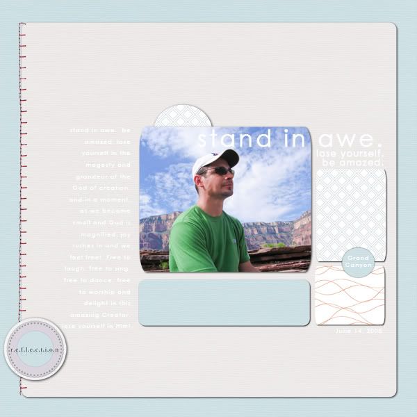
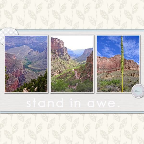
About time I started making more alphabets, don't you reckon? But they are a bit of a pain to make, all that cutting and trimming and renaming of files. But anyhoo, I'm here to present you with my collection of Glass Alphas - hope you like :)
These are all available at Funky Playground Designs now, or Two Little Pixels from 6pm tonight, with 25% limited-time discount. Yippee!
This is available at all three shops: Polka Dot Plum, Two Little Pixels and Funky Playground Designs. Just click on the links along the top blog bar, or on the blinkies at the top left to be taken straight to my shopfronts.
Here's what Margote from 2LP made with one of these:
Happy Scrapping!
So this is a little one today: how to make quick and easy word strips for your journalling on your page.
Step 1:
Type out your journalling in a journalling box, as per normal. Use centre alignment. Adjust the line spacing to be a little wider than usual, to allow for your paper strips behind it.
Step 1:
Type out your journalling in a journalling box, as per normal. Use centre alignment. Adjust the line spacing to be a little wider than usual, to allow for your paper strips behind it.
Step 2:
Select your rectangular marquee tool and draw a long strip. Fill it in any colour. Use it as a mask to clip your journalling paper onto. I tend to use lighter papers so the journalling contrasts a bit, making it a lot easier to read. Just make one strip, merging those two layers together.
Step 3.
Select your "move" tool (top left corner), and press Alt as you hover your mouse on the strip. A double arrow will come up and that means you have now copied the strip. Click and drag it away from the original to see it. Repeat for the number of text lines you have. When you have positioned them, move the side edges in or out depending on the length of your text.
Step 4:
Now you need to make them look a bit wonky, so select your move tool, and spin the little circle only slightly to make the strip move slightly diagonal. Or you could move the corner arrows around a little. Now add shadowing, and it's done.
Sending My Love:
Credits: Danielle Young Designs "Black Tuxedo QP" and Brine Designs "School's In" paint splat.
I'll show you how to get that paint to work across the frame like that on a quick page (one that's already flattened and non-transformable) next time.
Cheers :)
Tuesday, 15 February 2011
My Layouts,
tutorial
3
comments
Tuesday Tutorial: Learn More About Colours
Joey's posted a great article about understanding the colour wheel when scrapping, over at the Daily Digi, if you'd like to check it out and excercise your grey matter. She features one of my layouts in it too, explaining how it uses ...
Analogous color chords are pleasing to the eye and are often found in nature. One way to use this color chord is by using a “gallon” of one color, a “pint” of another color, and a “teaspoon” of the accent color. SkrappyKathy’s layout is a beautiful example of this type of color scheme:
Best part is I didn't even realise I was doing it at the time, hooray! Hope you get some kind of scrapping time in today - even if it's just sorting out your digi files (like my plans for the next few hours ...) Sigh.
"Analogous – Colors that sit next to each other on the color wheel.
Analogous color chords are pleasing to the eye and are often found in nature. One way to use this color chord is by using a “gallon” of one color, a “pint” of another color, and a “teaspoon” of the accent color. SkrappyKathy’s layout is a beautiful example of this type of color scheme:
Best part is I didn't even realise I was doing it at the time, hooray! Hope you get some kind of scrapping time in today - even if it's just sorting out your digi files (like my plans for the next few hours ...) Sigh.
Today's freebie requires a little help from you to unlock it! Go check out my updated Brine Design facebook profile and press "like". It will take you to a special unlock button :).
While you are there, why not check out what my creative team has been doing with my designs. Click on the Photo tab. Say hello
By the way, this quick page album has been created with my next kit, Cooper. It's not out yet, but you're getting a special peeky!
It's birthday time at Two Little Pixels and to celebrate three years of digi scrapbooking excellence, we designers have made up a heap of grab bags for you to purchase for only $4 each! There are so many goodies in this collection, which makes the price sooooo unreasonable, but anyhoo ...!! {It's definitely a steal for you guys!}.
Eeeek! I know it's a "grab-bag" so, technically, you are meant to buy it on good faith alone, the assumption being that there will be lots of extraordinary goodies in there for you. But can I give you a really blazen sneak peek? In my grab bag alone, I've included these new, exclusive kits:
Eeeek! I know it's a "grab-bag" so, technically, you are meant to buy it on good faith alone, the assumption being that there will be lots of extraordinary goodies in there for you. But can I give you a really blazen sneak peek? In my grab bag alone, I've included these new, exclusive kits:
Ever feel like making a non-photo layout? Well, these shadowboxes are the go. I made them for you to print out and put on your wall (you have the option of embellishing them more yourself if you want to) so that you may create gorgeous pages in a calm, peaceful environment. Of course, they would look pretty darn impressive on your kitchen or dining room wall too, you know. They have been saved at high-resolution so they print out as perfect enlargements. I think they'd look even better if you inserted them in a real-life white enamel frame too. That matt-on-matt look is really in at the moment. Anyway, they are little sayings to remind you of what's important.
Boring name. Not so boring product. I have visions of these little itty-bitties being placed on layouts with a clean background to create a kind of circular patchwork quilt-type look. But seriously, who am I to tell you what to do with them? I am really looking forward to how you guys put them to good use, on a layout page, on your journal cover, on your 365 Challenge booklet, on a hybrid OTP. There are no limits with these guys.
Getting back to making more templates, as this is what many of my fans/followers (gosh, I say that in the most humble tone) first started out with. These three 12inch square templates come in PSD and TIFF format, and include shadowing and additional elements as per preview (which you can turn on or off as you fancy).
Lastly, this alpha. Looks so simple, but let me assure you, it probably took the longest to make out of all this collection!
So, that's what? About ($3.99 + $3.99 + $3.99 + $2.99 = $14.96) nearly $15.00 total for only $4 bucks???!
But take note, the grab bag sale is only running from 11 - 18 February. After that, these items will be available at their full individual prices in store.
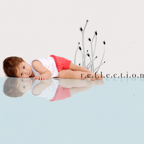
A reminder too, that all of these co-ordinate with the free Two Little Pixels blog hop Reflection kit.
Cool, eh?
Here are some pages completed by my wonderful Creative Team.
Cheryl
Tuesday, 8 February 2011
tutorial
2
comments
Tuesday Technique Tutorial: Cheat's Guide to Blurring your Photo Background
Every Tuesday I plan to add something to your digi-scrapping arsenal. It may be something quick and light, something heavy and brain-puffing, or just something I've picked up along the way that I find useful when creating my pages.
Today, it's a cheat's guide to blurring out the background of your portrait photos (especially handy when you don't happen to carry around your bulky 300mm telephoto lens with you).
Here we go ....
This is my in-progress layout (created with Nina Scraps' new kit "Soft and Sweet" @ oscraps.com) that I worked on this morning. I'm thinking I could turn it in now, or be a bit more professional about it and get rid of that distracting stuff from the background of the photo (aka - half of mum's head and leaves and stuff).
So, what can I do about it? A quick fix is to apply a gaussian blur to part of the image.
To do this;
- copy your photo layer (Ctrl-J),
- turn off the bottom photo layer (press the "eye" next to the image in the layers palette)
- activate the new, top photo payer (just click on it)
- select a soft-edge brush and click on your eraser tool
- rub out the subject you want to keep clear (in my case, it's my ugly double-chinned mug)
- go to Filter > Blur > Gaussian Blur and type in a radius of 20 pixels (or 10 if that's too obviously blurred)
- turn the other bottom photo layer back "on" (again, the "eye" icon)
- Done!
Finished layout!
If you've got any tips yourself, or a way to do this better, share it! Also link me up to your online gallery if you use this tutorial for something you make - I would love to see it in action.
Introducing ... Kendi. It's an African name meaning "The Loved One". And that's what this kit is about. I'm reluctant to call it a Valentine's Day kit, mainly because I've already done one!! But my Valentina kit was a girly girly type kit, lots of pinks and browns.
Kendi can be used as a masculine kit, lots of deep rich reds, creams and browns. A little bit of glitter and some flowers here and there, but ultimately, you can scrap your man with it - AND show him without offending his eyes (with so much pinkness). Yay and hooray! That's my little sister and brother-in-law in the previews.
Kendi can be used as a masculine kit, lots of deep rich reds, creams and browns. A little bit of glitter and some flowers here and there, but ultimately, you can scrap your man with it - AND show him without offending his eyes (with so much pinkness). Yay and hooray! That's my little sister and brother-in-law in the previews.
You can grab this collection in my shops at Two Little Pixels and Funky Playground Designs, or in the Plum Pickins section at Polka Dot Plum.
And here's a sweetner - a further 15% off the sale price of the bundle! Just enter this coupon code when you view your cart at Two Little Pixels: BD-kendi-kisses . This coupon expires at the end of February, 2011 (Aussie time GMT+10). Make sure you have logged in to the shop first, place the Kendi bundle into your cart, copy and paste the coupon code, and complete your purchase as per normal. Easy :)
Friday, 4 February 2011
blog hop,
freebie,
My Kits
67
comments
M.A.S.S.I.V.E. Birthday Blog Hop Freebie!
HAPPY BIRTHDAY
TWO LITTLE PIXELS!
Welcome to the Two Little Pixels birthday blog hop!
As you probably already know, 2LP is one of the stores I now sell my designs at, and I've gotta say, it is such a rush to be amongst such a talented group of designers there! A lot of them were designers whom I worked for last year as a Creative Team Member. Including (but not limited to) SAS Designs, Sabrina's Creations, Designs By Anita, Scooty's Designs, Siamese Studio (who has now left 2LP), and so many more! What a buzz!
So yeah, you'd probably see a lot of their wares in my own layout galleries because I used to go wild when I was a CTer!
To celebrate 3 years for the Two Little Pixels shop, we are giving away a massive - M.A.S.S.I.V.E. - freebie collaboration kit from all of our blogs. At the end of the blog hop, your kit should look something like this ...
Can you believe it!!!
So pretty.
(This link has now expired after 1718 downloads. Thank you!)
You can now get the full collaboration kit here.
You can now get the full collaboration kit here.
This freebie will be was available for two weeks! Woo hoo!
But don't forget to leave me some lovin' comments as a good old fashioned courtesy. Deal?
Here's what some of my team have made with it.
Aren't they the best creative team ever!!
You should have arrived here from Rita's blog, Blue Flower Art . Now you need to hop along to Brandy designs. If you get lost along the way (or one of your munchkins has a catastrophe that you need to attend to, and come back to this later ...)
Here is the full list of contributors:
* [ksharonkdesigns] - http://www.ksharonk.com/
* A-liya - http://a-liya.blogspot.com/
* Anita Designs - www.designsbyanita.blogspot.com
* Blue Flower Art - http://ctrl-alt-doll.net/blog/
* Brine Design - http://www.katharynbrine.blogspot.com/
* Brandy designs - www.brandy-designs.blogspot.com
* cherpea designs - http://scrapea.blogspot.com/
* Deca Designs - http://decadesigns.blogspot.com/
* Extase - http://comblerlennui.blogspot.com/
* Eloise - http://crazy4kids.blogspot.com/
* jot & scribble - http://jotandscribble.wordpress.com/
* JRstudio13 - http://jrstudio13.blogspot.com/
* miss kim designs - http://www.misskim.typepad.com/
* Margote - http://scropisoeurs.canalblog.com/
* Rainy Dayz Designs - www.rainydayzdesigns.blogspot.com
* Red Ivy Design - http://redivydesign.blogspot.com/
* Roadside Designs - www.roadsidedesigns.blogspot.com
* Rebecca - http://rebeccasscraps.blogspot.com/
* SAS Designs - http://sasdesigns.blogspot.com/
* Scooty's Designs - http://scootysdesigns.wamby.be
* Tracy Ann Little - http://www.tracyannelittle.com/search/label/Blog
* Timounette - http://timounette.canalblog.com/
So get hoppin' ;)
PS: If you can't find the hop on someone's blog, just check back later, as this blog hop is global-wide and everyone is in a different time zone. It officially starts at 6pm Friday night, Australian Sydney time (GMT+10).
PS: If you can't find the hop on someone's blog, just check back later, as this blog hop is global-wide and everyone is in a different time zone. It officially starts at 6pm Friday night, Australian Sydney time (GMT+10).
Thursday, 3 February 2011
Magazines,
toot,
tutorial
3
comments
Scrapbooking Memories Article: How to Make Digital Stickers
Got your copy in the mail yet?
If you haven't, sit tight - the Queensland floods and cyclones are wreaking havoc! What black cat crossed their path, I wonder? A bit further down south and we are having extremely hot, dry days and spending a lot of afternoons in the pool (lucky us). But we have all been glued to the news watching the horror unfold up north, and have discussed the possibility of donating a few (boxloads of) toys to those poor kiddies stuck inside barren, over-populated shopping malls while their homes are destroyed by nature's force. But Aussies are a strong, resilient mob and I'm confident this will not crush their spirits for long.
This issue (Volume 13, No.3) I give an easy-peasy tutorial on how to make digital stickers. It's something that comes in handy when you want to make your title "pop" a bit more off your page (or any kind of element, for that matter).
So go check it out, and take note of the new digital section in the magazine! It's glorious! And guess what? They are looking for more digital layout submissions. Why not give it a whirl yourself?
Here are the current submission calls:
Submission deadline: February 9, 2011
My favourite things: It’s time to scrap the things you love. Think about your favourite food, clothes, most treasured household item and the things you just can’t live without.
Digital: Calling all digi scrappers – we want you! Send us your works of art today.
Last week I offered a chance to win a $6 coupon to my shop to buy anything of mine your little pretty heart desired!
Well, I am pleased to announce the winner - Alannah! She was the third person to post a comment. Thank you to the total 6 of you who applied!! (humph!) At least the odds were really, really good, hahhahhaa!
Well, I am pleased to announce the winner - Alannah! She was the third person to post a comment. Thank you to the total 6 of you who applied!! (humph!) At least the odds were really, really good, hahhahhaa!
Alannah, I will email you with the coupon code. Happy shopping :)
... ok, I admit it, all this running around in digi land is making my muscles ache. So if you are good at tweeting, blogging, facebooking and enabling, APPLY, APPLY, APPLY!
Details (in case you can't read the ad)
Promo Team Call
You Get: free access to my kits
Duties: enable each kit @ 4 places
update Facebook / Twitter fan pages
update designer blog each week
make sale ads and promote as required
promote on your own facebook/twitter/blog
Apply: email your name, screen name, gallery, blog, CT teams to kbrine.design@gmail.com
Call ends in two weeks chickies!
Subscribe to:
Comments (Atom)


- Follow Us on Twitter!
- "Join Us on Facebook!
- RSS
Contact